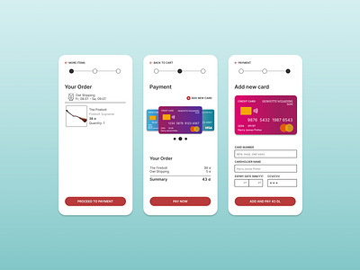
DailyUI: Challenge 002 - Credit Card Checkout
DailyUI : Challenge 002 - Credit Card Checkout
Hi folks!
It’s me again, Carolina, a Product Designer • UX/UI Designer, residing in Berlin.
For the second challenge, I designed a Credit Card Checkout, and honestly, it didn't take me less than 1 hour, but mostly because I enjoyed doing it so much.
This time, I've got inspired by the world of the novel Harry Potter, which of course I'm a fan of, it came to my mind when I had to look for a bank for the credit card and of course, Gringotts is maybe the most famous fictitious one. From there, I couldn't stop researching more about the broomstick's manufacturing company, the price, or Randolph Spudmore, the producer. Yeah, JK Rowling is one of the master women of creativity!
I used some red tones since that's the color the store Quality Quidditch Supplies, and I even converted from USD to galleon, the magical currency (Yeah, most of the time I'm so nerdy... So you can imagine, if this is only an exercise, you have no idea how I am as a Designer!)
This time, I didn't have to think of an industry, or should I say I cover the Sports industry? Btw, please take a look at the Owl Shipping icon, as you can see I'm always thinking to design for the user!
Please, if you have something to share, everything is very well welcomed!
If you want to know more about me and my work, take a look through these links:
Portfolio: carotorarza.com
LinkedIn: in/carotorarza
Medium: @carotorarza
Instagram: ux.carotorarza
#DailyUI
