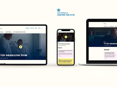
Nationalt Center for Etik
Digital design and identity for the Danish National Center of Ethics! ⚖️
Super fun project where I took a lot of inspiration from newspaper and print layout. Soft colors enhance the readability in the relatively large amount of articles and text on the page, and the large GT Super from Grilli Type gave the design that extra character in the headings I always love.
Fun fact: The site and design was user tested, and the educational part of the site got an absolute top score! The user test consultant mentioned that she only saw a score that high when testing the Danish app Mobile Pay.
More by Ask Stig Kistvad View profile
Like
