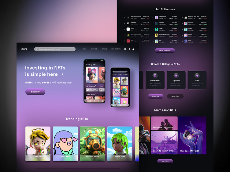
NFT marketplace (web design concept)
Hello 👋🏻
Here's the web version of MINTO - an NFT marketplace that's easy to understand, fun to use, and approachable for all.
NFT is mainly still cryptic for the public. To add to that sense of mysteriousness, gradients of purple-pink are used on a dark surface. For contrast, glassmorphism is used to create a clean look to the overall UI. Besides, the addition of purple-pink gradient brings more "fun" and liveliness to the otherwise dark background. Why gradient over solid colors? Gradient offers a sleek and smooth touch as if everything is connected.
Since MINTO aims to cater to users of all levels, the learn section has got to be a crucial part in helping users, with no to basic knowledge, understand what NFT is and how it works.
Any thoughts on the UI? Let me know in the comments ✨
"Press L" if you liked it 💜
Thank you! 💖


