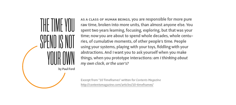
Type Set Match: 10 Timeframes, No. 1
This shot was originally a rebound of one of Tim Brown's Type Set Match entries. I've increased the resolution of the image so that it holds up better with today's Dribbble guidelines.
---
Given the topic of this excerpt—our collective (human) experience of the passage of time—I started thinking about expansion and contraction. For this reason, Rama Gothic Condensed felt like an appropriate selection for the heading.
For the body, I chose a lovely humanist sans from OurType named Alto. It feels expansive when compared to tightness of Rama Gothic Condensed and the two typefaces just felt right together. A happy accident more than anything.
I also couldn't help thinking about data visualization (how else does one visualize the passage of time?) and went looking for a way to justify using FF Chartwell Pies. Ultimately, I used it to evoke the feeling of a setting sun.
