Type Set Match: Creating for the Brain in the Body
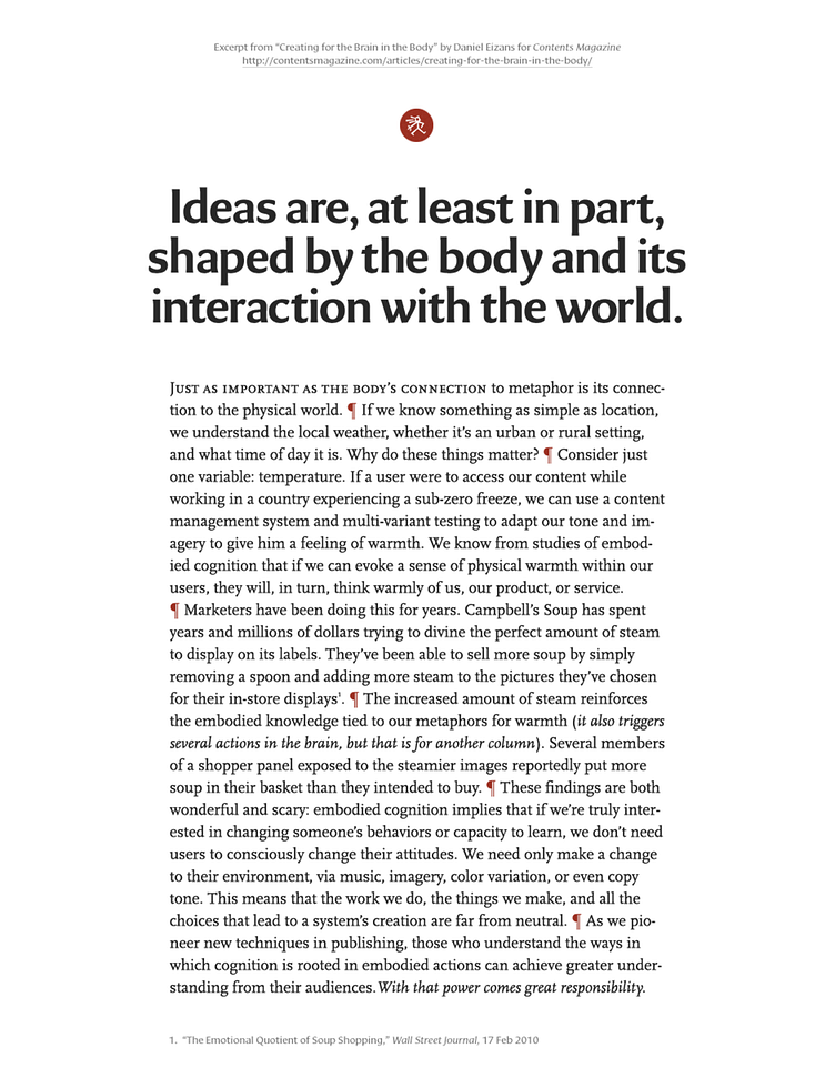
This shot was originally a rebound of one of Tim Brown's Type Set Match entries. I've increased the resolution of the image so that it holds up better with today's Dribbble guidelines.
---
For the main heading I chose Eva from the Ourtype foundry. It has a warm and fluid that evokes a human touch—much like the ceramicist Eva Zeisel the typeface was named after.
For the body I chose Scala by Martin Majoor. Its proportions and letterforms are similar to Eva but it still contrasts nicely. Aside from being serifed, the angularity of Scala plays nicely with the casual smoothness of Eva.
For captions and footnotes I chose Cora from Type Together. It's an unusual experimental typeface with a large x-height thatholds up well at small sizes. Cora possesses a shape and character that feels to me like a more formal cut of Eva.
Finally, I added a little graphical flair by using a glyph from the ITC Ancestor family. The visceral and primordial spirit of the article sent me searching for icons I could use to help establish the right mood for the article. I was thinking about cave paintings and pictographs when I stumbled upon ITC Ancestor. It turned out to be exactly what I was looking for.
I did also create a few variations on this idea using combinations of the above-mentioned typefaces as well as Quadraat, Quadraat Sans, and Fresco Sans Plus as seen below:


