BATCH PANTRY - Olive Oil Bottle Label Design
Case
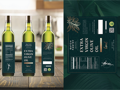
Brand that sells kitchen spices and other products asked me to redesign the olive oil label that already have, they feels the label they have is less attractive and prominent, doesn't look authentic and doesn't have the characteristics of one product to another.
They want clean label, simple, luxury, and cover some of the bottles of olive oil they have.
Solution
To make the labels look clean I created a bit more free space and placed the text layouts that weren't too close together, using more sans-serif fonts for a simpler look.
I use a dark green color with ornaments on the background, and use a little olive oil illustration using a semi-vintage style, using a serif font in the title and a metallic gradient color to give the impression of luxury.
Gives a metallic gradient that is not the same on each label, making each product hasits own characteristics
THANK YOU SO MUCH!!
let me know if you have any questions or you want to work with me
Instagram : Ikhsanerdiansy
Linkedin : Ikhsan Erdiansyah
Email : Ikhsanerdiansy@gmail.com
please comment and give me feedback with this label!!
