(2021) Anti-Stroke Foundation
My Role:
Product Designer
Task:
Redesign educational app about brain stroke to be more oriented on young people.
Solution:
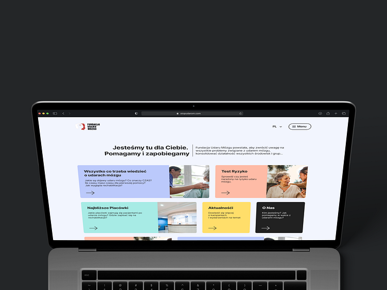
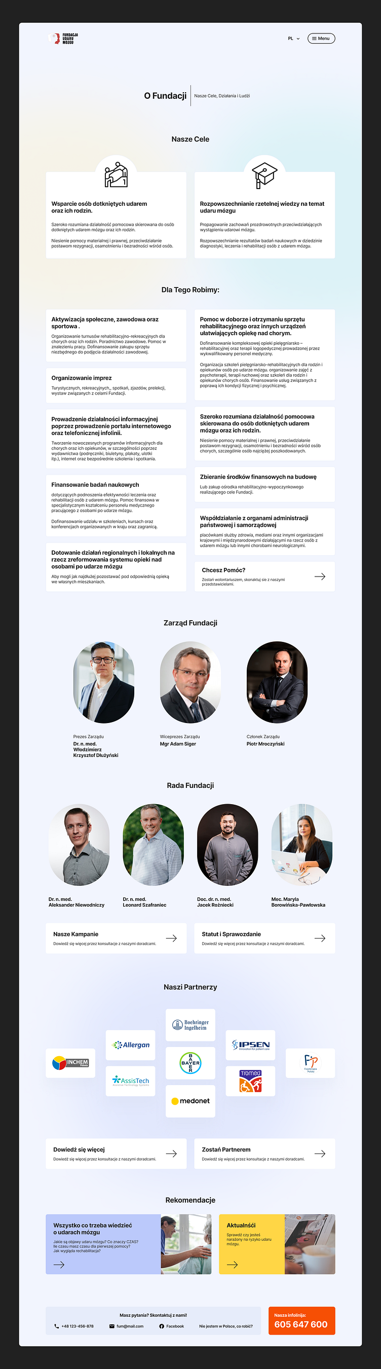
Creation of separated educational portal, and updating main foundation's web-page with same visual language.
Discovery
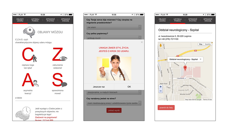
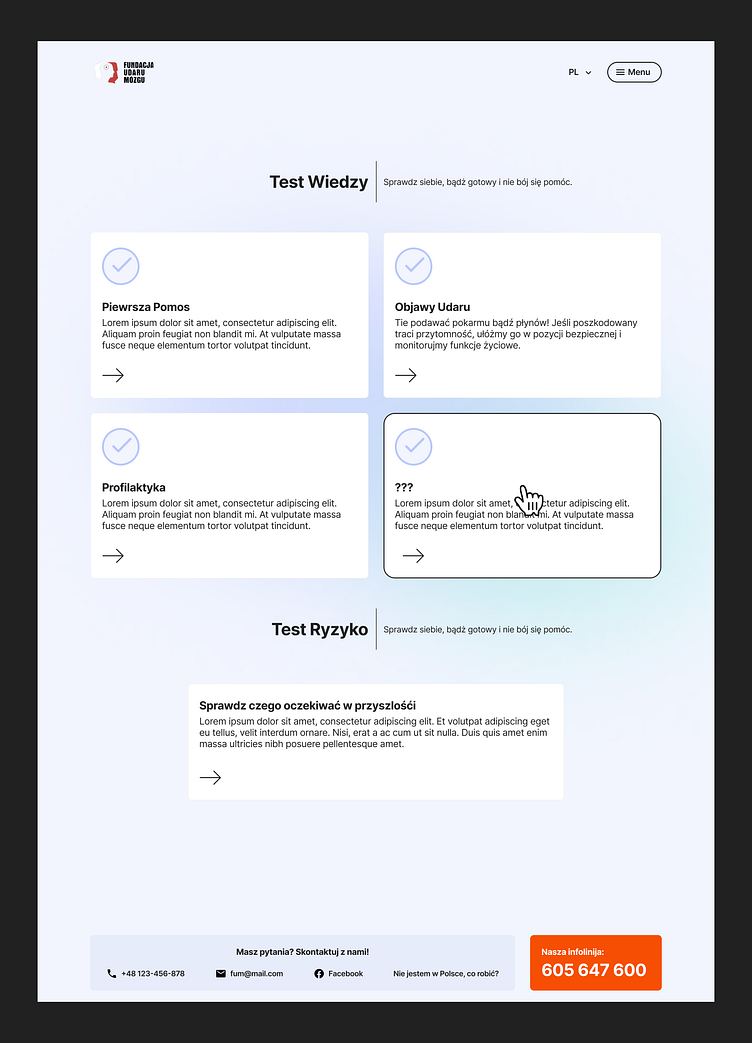
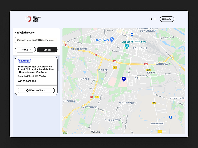
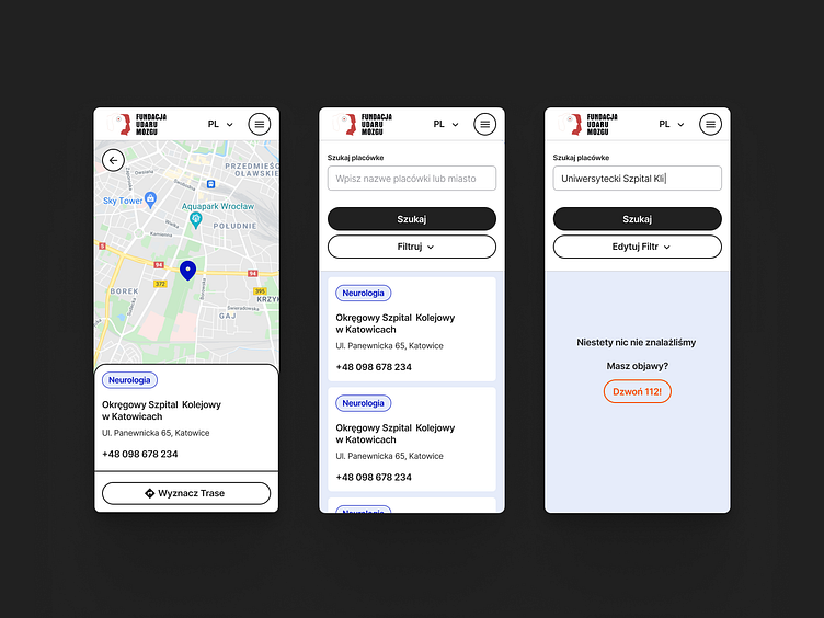
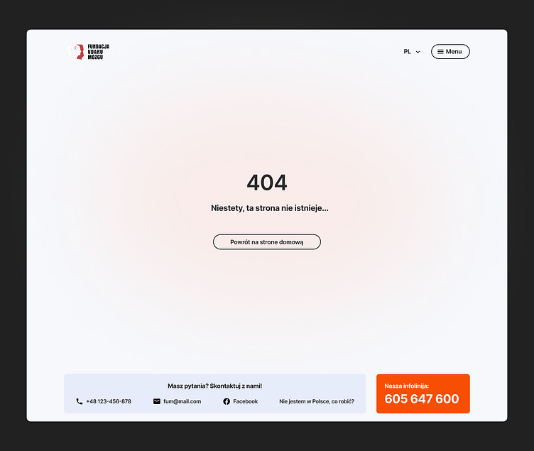
Client appeared with idea of redesign an existing mobile application. It contained useful information about stroke symptoms, the nearest clinics search, and self-check feature represented in test form - Group of Risk test & Knowledge check.
Convincing client to move from app to webpage was smooth - nobody gonna look for such information in Play Store, but search in google. Also, if you try to look for such materials, first few lines will be useless, so we have a niche to fill with our content and build strong connection between this portal and main web-page.
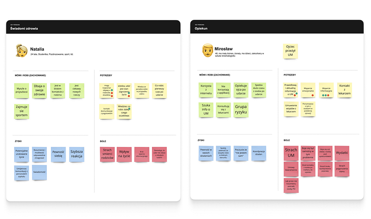
Finding the right solution requires understanding of the target audience.
Interpretation
Value Proposition Canvas, perfect tool to convert those insights to content.
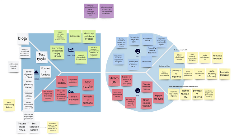
Workshop revealed the fact that people struggling for guidance in critical situations and some kind of tutorial what to do, how, and what to expect next.
Ideation
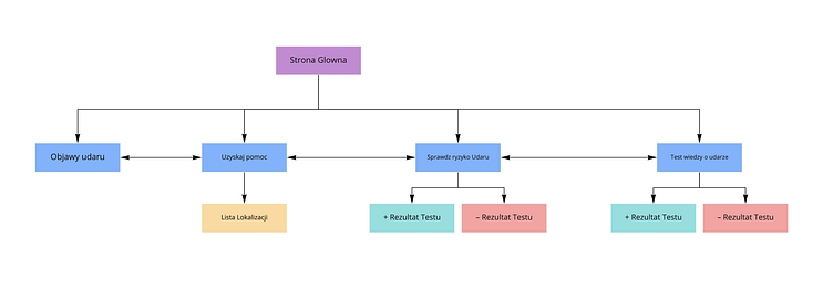
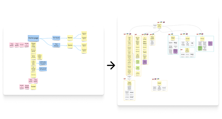
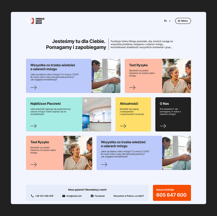
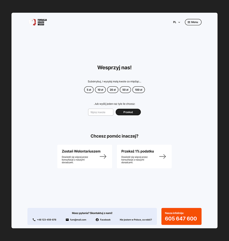
With help of Card Sorting, the information Architecture for Educational site was mapped down. This is the key point of this project — the comeliness of the educational web-page was high enough to be just a page with info. We rethought the concept, and integrated content and features into the main website.
According to Poland's population specific, it will be useful to provide content in few languages, and as a result for bigger number of visitors.
The new shape of the page was the hub with the most important links, and contact info. Lo-Fi and Mid-Fi Prototypes are great tool to catch all mistakes on the early stage and also communicate ideas to the client and manage their expectations.
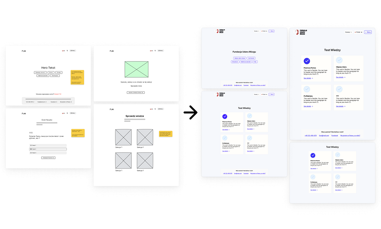
The Mid-Fi prototype was built using a free UI-kit with preset of components. This trick saved huge amount of hours and helped with finalized designs. Client had an access and was able to provide valid content using comments feature in Figma.
In parallel, we researched for existing solutions from similar foundations or social campaigns.
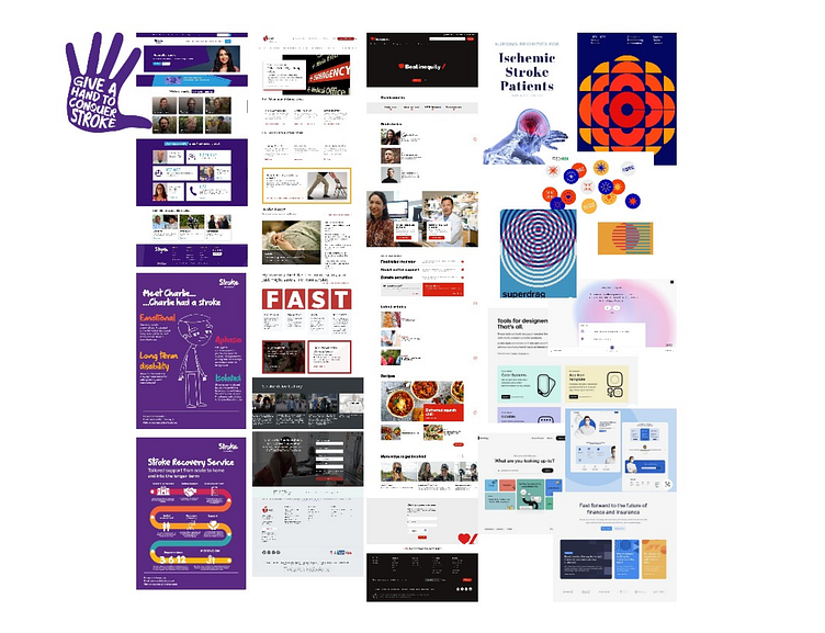
The overview of patterns-in-use gave us a vision of what our visual language should be, and what we must avoid, providing smooth experience.
Mostly foundations on medical theme are using blue, white, red colors, sometimes too much. Sometimes content structure is messed up. To avoid common mistakes we are following few rules:
Accessibility First — Contrast level AAA.
Minimum Content — Maximum Value.
Calm and humane design methodologies.
Self-supporting design.
The last item is the most interesting — foundation has no designer, so they wouldn't be able to create custom icons, illustration. There is also possibility that if we give them too much freedom to manage content on their pages, design will be spoiled — so we created the list of items that they control and reduced everything that requires designer's involvement.
We use photo, not illustrations.
We use material design icon set only.
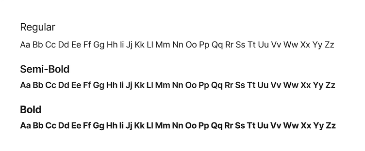
We use Inter font family, because it's elegant, flexible, and free.
We use a predefined set of colors.
No shadows on active elements.
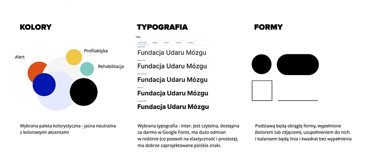
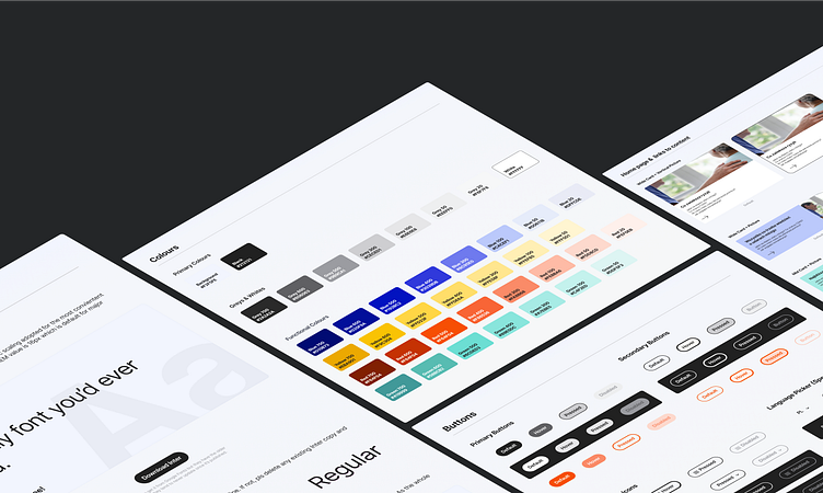
Colors
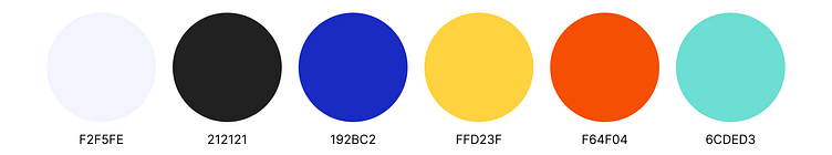
Simple color pallet assure the contrast consistency among the designs. For specific cases, like background visuals, or soft highlights, we extended the pallet with shades of colors above.
Shades used for creating simple color coding for different items. This solution sets regularity in the soft way.
Typography
Content is the king, so the typography shouldn't still attention.
We're using only three font weights of Inter Font Family.
Hi-Fi Design


UI-kit
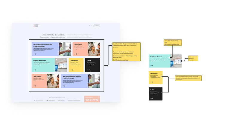
Without a structured library of components, there is no way to correctly transfer UI principles in such a project.
To answer potential questions upfront, I prepared pages with explanatory for developers. For example, home-page cards behavior:
Summary
Right now design is ready for development and waits for the team to form, but because I'm no longer in the company I'll not be able to see and guide development as a designer.
Anyway, I can call this project one of the most interesting because of the freedom I got here. Freedom to put constrains on the design approach, to create accessible design that brings value to society.
If you want, go and check Figma file, link below.
-
Special thanks to Anastasiia Shvets, for her great support with art direction.
.
Press F / L to pay respect.
.
Follow me on Instagram, LinkedIn
.
Have a nice day ✨