Gossip Company
Branding of a wellness & beauty company
Where beauty & wellness meet sustainability
Gossip Company is a New York based wellness brand that is launching its products globally. A great thing the company is doing is partnering with local labs and production facilities in several regions on the globe to minimise the waste and greenhouse gas emissions and support employment in local communities.
Challenge
The company’s philosophy is to create bright and beautiful home products for a young audience while minimising the band production’s impact on our planet.
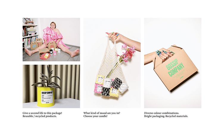
What is more, we had to consider that the client was going to use only recycled materials for the product development and packaging while working on this project.
Solution
We wanted the brand to be as far as possible from calm, chill and pastel colours. So, instead, we made it fun, bright and loud like its young audience.
Positioning & Naming
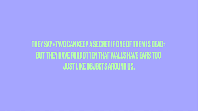
Imagine you’re having dinner with your friend while exchanging your stories and gossips. So the chances are quite high that there’s a candle between you two. Guess what? Candle can hear it all. That’s how we came up with the brand name Gossip Company.
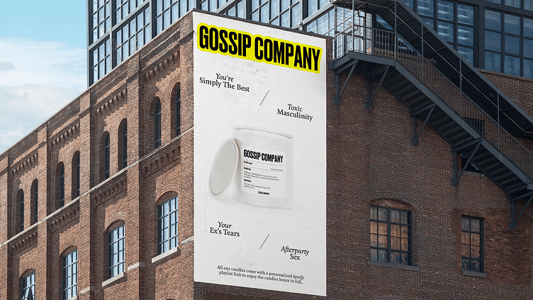
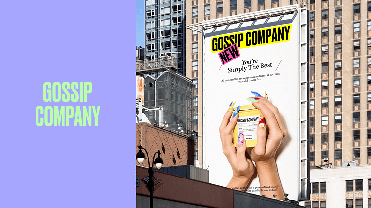
The product line’s naming:- Your Ex’s Tears (we all have cried on a friend’s shoulder after a break-up)- Toxic Masculinity (we all have those in our lives)- You’re Simply The Best (we all take some time to appreciate our friends and tell them how much they mean in our lives)
That’s how we gave a special attitude to each product that would fit well with the audience, depending on their mood and life situations they are in.
Design
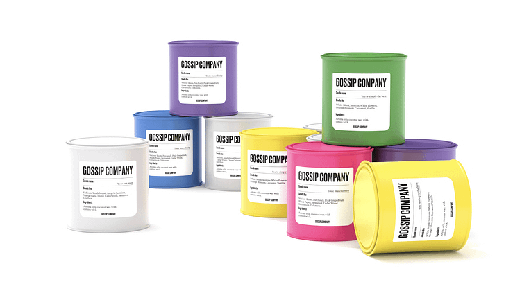
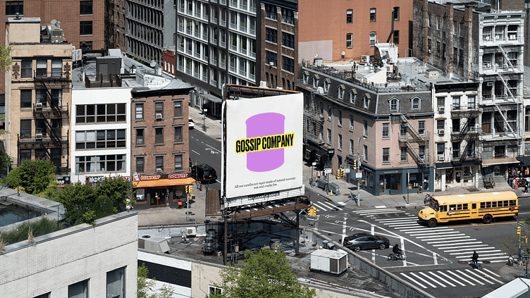
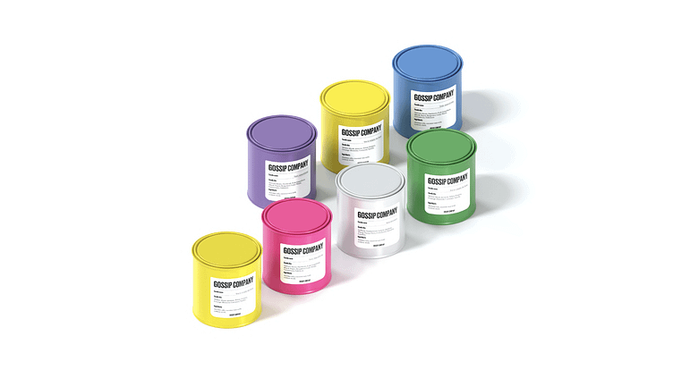
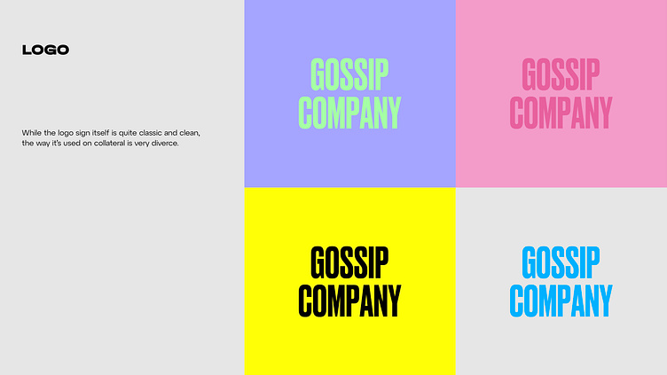
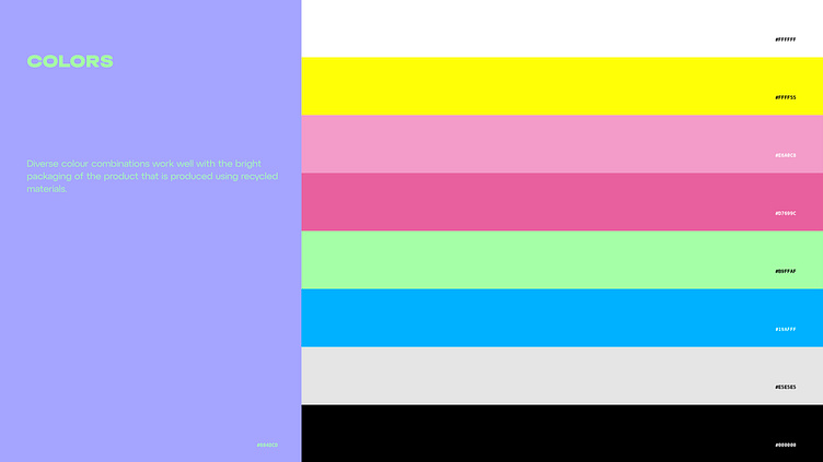
When we got to the design stage, we knew that the brand had to translate the bright lifestyle. While the logo sign itself is quite classic and clean, the way it’s used on collateral is very rich. Diverse colour combinations work well with the bright packaging of the product that is produced using recycled materials.
The imagery style is very 3D heavy, since we wanted to give a unique digital vibe to the brand that makes it stand out from the competitors.
Result
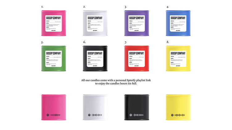
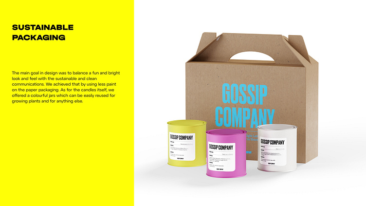
The main goal was to balance a fun and bright look and feel with the sustainable and clean communications. We achieved that by using less paint on the paper packaging. As for the candles itself, we offered colourful jars which can be easily reused for growing plants and for anything else.
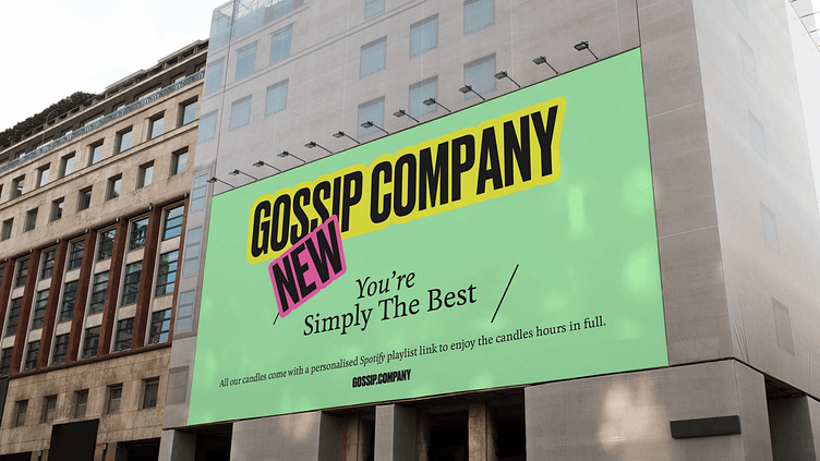
We also added a QR-code with a special Spotify playlist to each of the product, which made it even more personalised and fun.