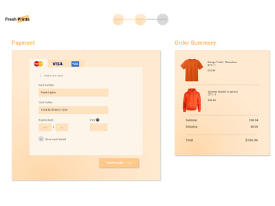
Daily UI challenge no. 002 : Credit Card form
Day 2 of #dailyui
A minimalistic approach for the credit card form. Users should feel the ease filling those numbers away for purchases.
Looking forward for any feedback. #002
More by Frank Laibin View profile
Like
