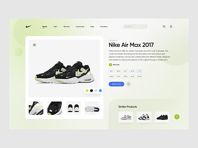
Nike UI Concept
This is the Nike UI Concept. Nike’s web UI is clean but I felt that the product page had alot of features, making it a bit cluttered. I got inspired specifically from their shoes’ website and recreated it giving a touch of my style. The one thing I learned while designing this was that more the white space, more appealing could your concept be if you can understand and feel the flow from it.
Hope you guys liked it!Let me know in the comment section about your thoughts on this.
For more inspiration checkout my instagram.
More by swati panchal View profile
Like
