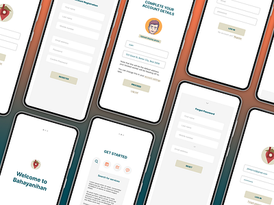
Bahayanihan v2
My first try at UI/UX design. I used Figma.
Process:
This prototype is an inspiration from my Fiance's thesis. I wanted to work with flats and practiced with this.
Research:
There are a lot of white spaces and in my view, white spaces can be intimidating. It pulls you to focus on details. Thus, the paper-dot phenomena and positive/negative images.
Drafts/Alternatives:
Font color
I played with color palettes which can fit with the logo my fiance made. The first draft, I used maroon and olive for the primary and secondary colors (see first frame) and then decided to use bluish green and orangey coral for the final colors.
Font face
I used the default font (Inter) from Figma. I might work my way through font-usage soon. Right now, I'm just playing with layouts, colors, and templates.
Background
I used a gray background on my first draft, but when I tried using it for the homepage, it did not fit right so I opted for white. White is always a safe choice (at least that's what I think).
Learned:
There are still a lot of 2D and flat designs I need to learn. I have produced this one out of what I have learned so far. I hope you guys like it.
