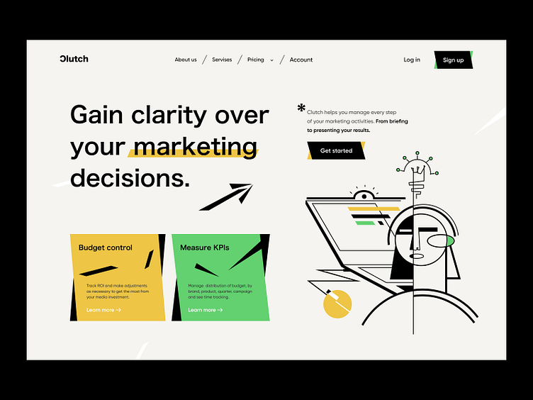
Clutch home page
Hey all,
Works for marketing agencies are our favorite precisely because you can give creative freedom and use non-traditional illustrations and content presentation.
In this work, pay attention to the illustration and style of the cards. There is no mundaneness or anything usual here. We experimented a lot to get such a result, and in general, we achieved the effect we wanted.
There is a clear understanding that the site is simple at first glance. Together with the illustration, the CTA immediately catches the eye and encourages action.
The agency’s primary advantages over others are also clearly read in the first two blocks.
Extravagant style attracts and captures attention. How about such a bold decision for our client?
Hey all, what do you think about designing what we did?
Press L — to make us 😁
⭐️ ⭐️ ⭐️
Art director — Taras Migulko
Design — emote.agency
⭐️ ⭐️ ⭐️
Awwwards | Behance | Live website
We are open to new projects 💌 hey@emote.agency


