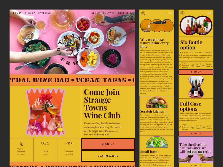
Strange Town Web Design
Strange Town had some logos, but none of the elements were cohesive to their plant-based wine bar vision. I developed an overflowing chalice mark representing the abundance that grows in Wisconsin. The logo mark works by itself or locked in a badge.
The typeface Digestive from Ohno foundry was a perfect match for strange Town. The reversed contrast and funky organic shapes work perfectly with Strange Town's vibe.
I designed a vibrant color palette and a simple type system to be flexible so it could be used in both print and digital design
I designed the website to show Strange Town's offerings, including a natural wine monthly subscription, catering, menu, hours, and to tell the brand story. All elements are mobile responsive.
Have a look at the Figma file.
https://www.figma.com/file/zAg5CcJFKmanA6BIYDLigj/Strange-town-site?node-id=3408%3A61
