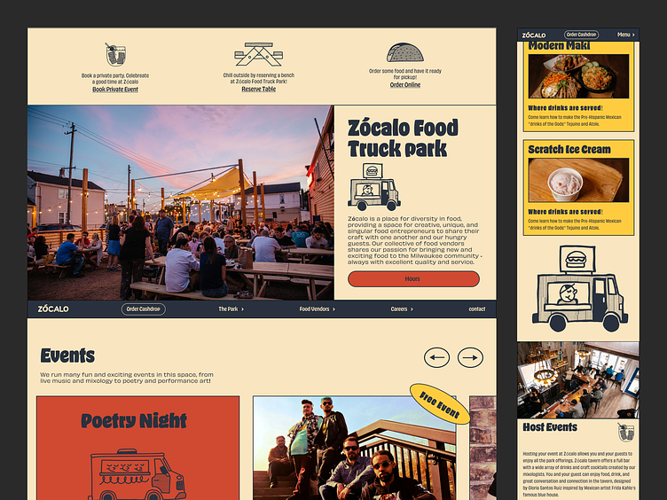
Zócalo Web Design
Zocalo food park is not just a place to hang out, eat and book private events. It is also a place where food entrepreneurs can get their start in the food truck business. Zocalo's needs are more in-depth than the average food truck park. I helped clarify their creative direction and designed and developed a Webflow CMS site to help them manage their content and tell their story.
The stakeholders' goal for the website was to increase the number of private party sales. I was able to achieve this with the website redesign. I first gathered data using Hotjar and Typeform surveys to determine user pain points. Once the pain points were figured out, I created wireframes and user flows that would accomplish the goal of increasing sales.
I redesigned their type system using OhNo's Hobeaux and Obviously. Two typefaces that are playful and readable are used in their digital marketing and website.
We were drawn to playful yet informative illustrations that would pair well with the photography—used to emphasize a point of communication or the focal point in touch when no photographs were available.
Zócalo is a food truck park that has a lot going on. Everything from events and popups, a growing number of food trucks, changing hours, and event booking. The website is designed to be the central focus of finding out what is happening
at Zócalo.
Feel free to take a gander at the Figma file.
https://www.figma.com/file/Gedz0pP8J4pGo6mzwNYFei/New-Zoc?node-id=2838%3A120
