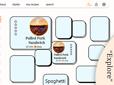
Reciperi Explore Recipes Page
This design is another segment of my Reciperi project. Reciperi is a company focused on making healthy eating more approachable and fun, so I chose colors that would help allude to these qualities. This page contains recommendations for users based on their profile. I wanted the grid to be a little out of the ordinary, but I still wanted the cards to be easily readable for users. I came up with this grid of different sized cards positioned all over the page. My idea is that the cards will be slowly moving upwards unless the user hovers over one of them. In that case, the card will stop moving and get a little bigger in size. I'm not sure how well this would work, but I thought it would be a fun idea to explore!
More by Jordan View profile
Like
