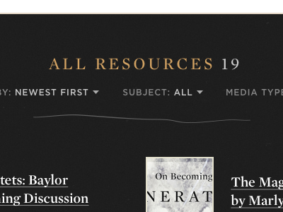
Clean type and messy lines
The Fujimura Institute logo uses a series of strands – we’ve started pulling them out and using them as "crude" visual elements on their new site design. What do you think?
More by Cantilever View profile
Like

