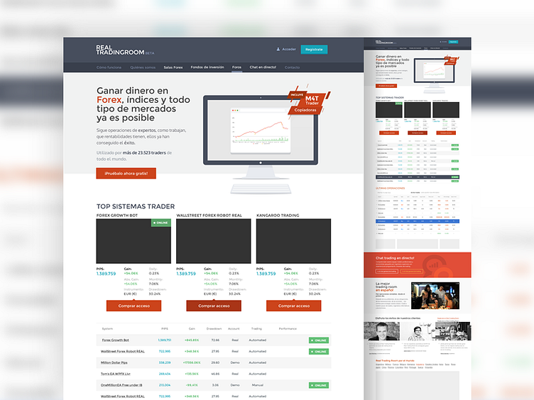
Real Trading Homepage layout
A "not so trendy" Homepage design made for my nice pals at Nitsnets. But everything's flat so I liked it.
P.S: About table design: http://darkhorseanalytics.com/blog/clear-off-the-table/
More by Armando Sotoca View profile
Like
