Because the kindle icon is terrible
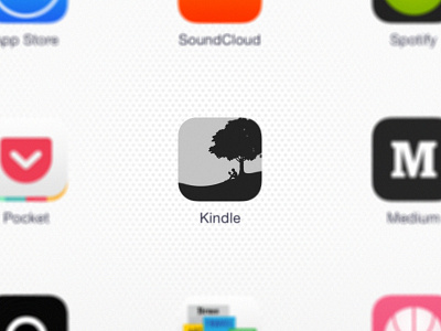
Am I the only one that thinks amazon should be selling the fact that they made the first e-ink reader successful enough to be a household name? I had to make this icon as an homage to the lovely aesthetic of their old fashioned e-ink machine.
(And because the kindle icon is so ugly (no one in their right mind puts the name of the app IN the icon AND beneath it, dammit))
Plus e-ink is one of the only instances of skeuomorphism that don't contradict flat-and-minimal design.
