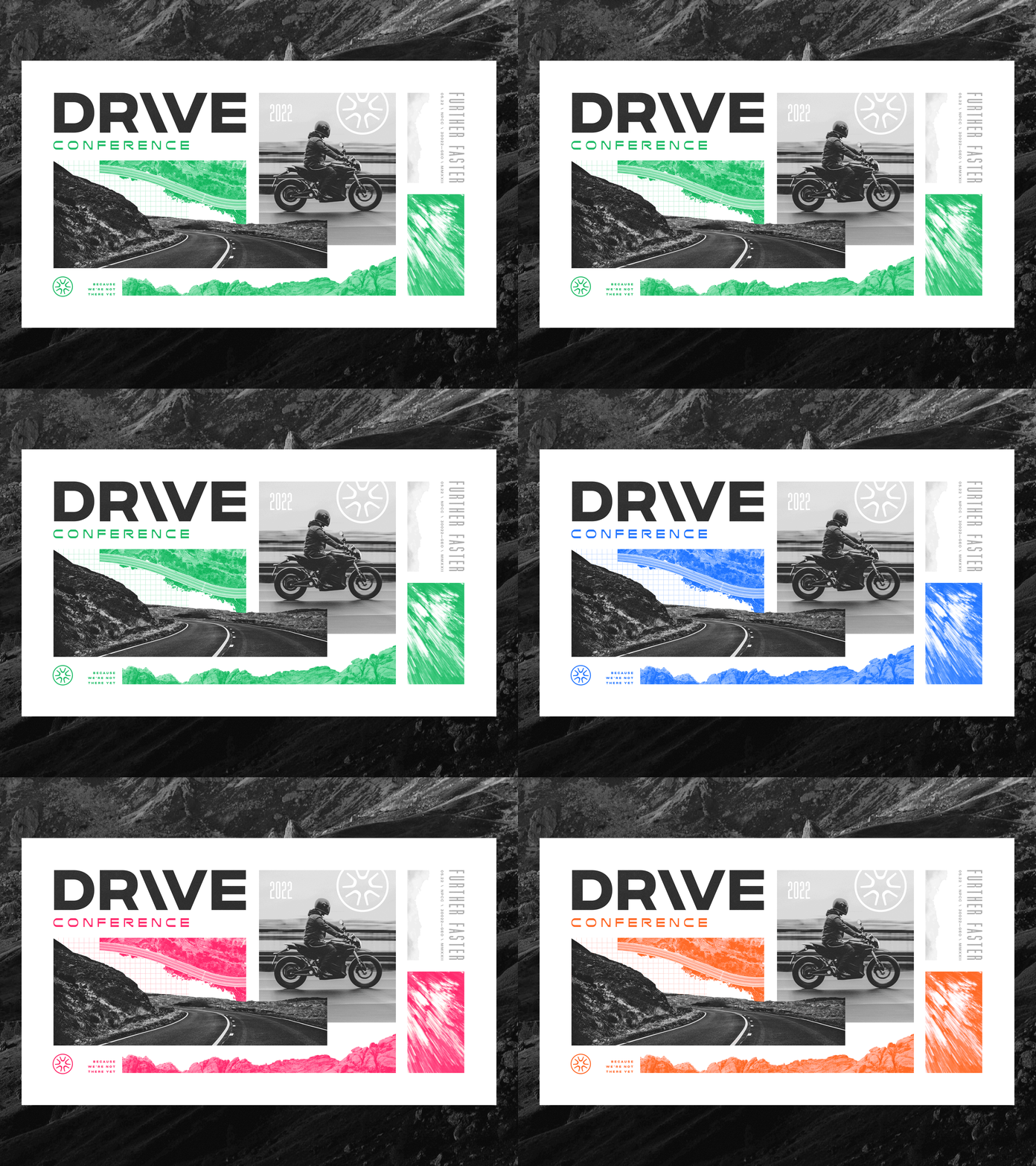
Drive Conference Key Art 2022
Drive Conference 2022 — for this year's conference look, I wanted to leverage a collage style that allowed for clean grid-based design, while also creating overlapping elements with irregular edges.
The approach to color was to imagine everything as a two-color print. Only grayscale and one bright color was to be used on any given item or composition, however, we had five key colors we could choose from.
The above is actually an unused version of a shirt design, but I loved how it turned out. The shirt we actually printed is very similar though.
This year, Drive was technically two back-to-back conferences for slightly different audiences. We used different key colors on booklets and journals to help distinguish between them.
During the conference, we cranked out a crazy amount of social media content. The above is just a collection of reel covers for Instagram.
I'd also like to say a sincere thank you to the many incredible Unsplash contributors whose photos I used for all these compositions.


