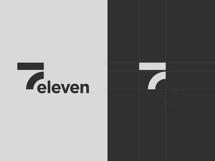
Logo Redesign | 7-Eleven
Hey Guys✌🏼
I came up with the redesign idea of the 7-Eleven logo because their current logo is clearly outdated and needed modernization.
I stuck to a minimalistic style, but at the same time, I kept the brand recognition.
The logo I have executed in two color palettes: monochrome and with the use of brand colors.
I would be happy to hear your opinions in the comments🤘🏼
▪️ ▪️ ▪️
Looking for a creative logo designer? I would love to hear from you👇
Email me: info@ux-mind.pro
More by Ihar Kolesen View profile
Like


