McDonald’s Logo Design Drastic Modifications From 1948 Till Now
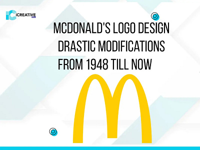
They need to keep everything up-to-date in order to walk with the world. Right? And when it comes to your brand or business, it’s the most important thing. Here we have an example of McDonald’s logo design; it was way different when it first started. However, if we see the recent one, it’s an “M” with two arches with a red background.
