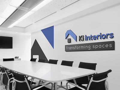
Logo Home Interior Designer
Specialised in transforming every inch of space into dream homes that clients envision, the interior design company "Ki Interiors" wanted a one-stop rebranding solution from Pageii Studio to better communicate their core competencies and corporate outlook in the Home design and decor market segment.
The word “Ki”, means “wood” in Japanese and is synonymous with the client's determination to create things that look beautiful in its natural state and yet, as intricately built as Japanese architectures as symbolised in the bluish "rooftop" part of the logo.
The Second part of the logo, "interiors", is symbolised as a dot from the abbreviated word "interiors". The same dot also doubles as a pictorial representation of a window. The sum of parts "k" and "i", creatively interpreted, creates a pictorial representation of a modern home to better communicate the client's flair in its specialised market segment.
Lastly, the new mission statement of the company “transforming spaces” is embodied in an accompanying stretch of a long solid-green rectangle to express the company's promise to understand every nuance in their client’s requirements and to make good use of client's precious spaces with creative tenacity.


