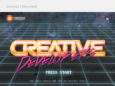
Retro-futuristic software house site
Earlier this year we were approached by a pretty big software / web development company who asked us to re-do their site. They weren't just looking for a plain, corporate-ish client bait, but something that will set them apart and and the same time, allow them to show off their coding skills.
The idea we pitched them revolved around retro-futurism, tron-esque grid planes, glitches, inspired by the 80s but also some other awesome stuff ("Hotline Miami", anyone?). Attached two moodboards below, they should give you an idea of the vibe behind this. :)
While they loved the idea, the screen I attached was initially rejected, mainly due to the "press start" line which was supposed to load the next screen (I changed it to "press any key" later on to make it even more retro), the client argumented that they were afraid to be percieved as a game development company, which made a lot of sense.
Within a week or two the site evolved into a slightly more subtle version (although not that much different) and it's currently in development since AFAIR summer. I expect it to be online within a month or two - takes time, since everything you see (even the typography) is made using just HTML/CSS/JS code.
What do you think? :)


