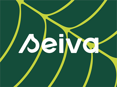
SEIVA - Natural School - Brand Identity
Seiva is a digital school focused on knowledge for a more natural life and more connected with our own humanity.
Seiva (sap in portuguese) of plants is responsible for delivering all the nutrients they need, both raw matter and the material already enriched post photosynthesis. Education is a fundamental part of our lives and just like sap, it can be enriched when it circulates freely. Talking to Lua and Kamaia, sisters and partners, it became clear the need for the brand to be born modern, bringing a differentiated and impactful look, inspiring customers to have a simpler life and connected with nature, promoting autonomy in relation to the use of certain cosmetic products.
The logo was constructed from basic shapes and the result was a typography without serifs, with rounded corners, which conveys a friendly and modern feeling. In the negative space of the letter "s", the concept of a leaf was applied, a subtle touch, but that adds personality to the brand.
Contrasting with the regular shapes of the logo and inspired by the parts of a plant, the graphics were developed using free lines and organic design.
