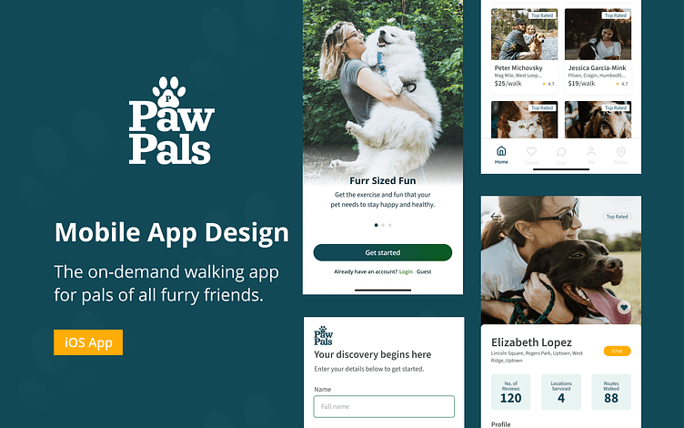
PawPals: iOS Mobile App
Role: Product Designer | Tools: Figma, UserTesting | Timeline: 3 Months (2022)
As social beings, we spend majority of our lives discovering, making and nurturing friendships which can take shape in different forms. From this human perspective, we cant overlook that of our pets. Having a pal for your furry family member can help in soo many ways, especially when you are unavailable.
PawPals was created to offer companionship to your pet when you are unavailable by discovering and connecting with passionate animal lovers. Using your contacts and social media list as well as local pet communities, you are able to keep your hairy (or not) family member entertained while you are away.
The Problem: Finding Great People
Finding people you can trust to service your pet can be extremely difficult, especially when you are a busy professional. Ideally family members and close friends seem to be the initial point of contact that are asked to help. With mobile applications trying to solve these problems, I'd set out to try and focus my attention on that obstacle.
What types of identifiers give pet owners confidence in working with someone?
Are testimonials good enough? Any profile badges, icons that can help define?
How can one measure trustworthiness in pet walkers?
The Opportunity: Discovering Pet People
After dedicating some time to gather insight from pet owners, I set out to interview 8-10 pet owners ranging from long standing dog owners to recent lizard enthusiasts. Reviewing the feedback, there were some unique cases with a ton of overlap on topics with finding someone who is trustworthy, reliable and has a love for all pets. These seemed to be very important attributes as most pet owners have expanded their familes with multiple pets.
Challenges come from pet walkers who focus primarily on dogs and not outdoor cats while some cats lovers avoid snakes. This disconnect birthed the opportunity of finding pet people who are available to "care for all animals" and not simply a single pet. PawPal focuses on connecting pet owners to pet lovers that are not exculsive to any type.
PawPal focuses on connecting pet owners to pet lovers
that are not exclusive to any pet type.
The Approach: Think. Sketch. Repeat.
Evaluating current mobile applications helped identify areas of ux and business opportunity. While some apps focused on scheduling appointments, others made the goal of using its' community to make connections. The gap between the products helped hone in on discovering a single provider over all of the animals in the household.
Looking at the system functionality, I made it a point to think through the full system so that each step in the customer journey was idenitified and accounted for. This flow helped shape how the user's interaction would occur doing every touchpoint in the product. Additionally, it helped shape some of the user flow and wireframes which are vital to the creation of the application.
The Design: A Trustworthy Pal-ette
As the business space for dog walkers increase and becomes a more active community, attracting the right audience is key. Having an inviting color palette with distinction from other products began by exploring the values of the brand. Something that promotes being trusted, reliable and had a bit of playfullness was the north star of visual direction.
Introducing some warm tones of green and muted colors of grey began to take form. Pairing these dominate colors with a radiant yellow had the ability to offer a happier complimentary color whilst shaping accessibility. After deciding on the color choices, I tested them against WCAG (Web Content Accessibility Guidelines) standards to verify the usage and got to work. Creating patterns, logo and some iconography for use across the product was fun and unpredictable. This step helped inform the UI Kit, visual styles and direction.
Having the branding fairly defined and working through some of the visual direction, it was important to start exploring how the application would function. Referencing the userflow, I began hand sketching various screens for onboarding, discovery and the user profile layout. During this process, I often use techniques like Crazy 8s to explore many options. Following this process, using the Double Diamond method to go wide and then fiter. This approach was used to then steer the direction towards creating high fidelity design layouts.
The Test: Prototypes for Pals
Having a visually attractive mobile application is not enough these days to secure, strengthen and guide users to engage in your product. I've learned early on about the value of prototyping and sharing it to garner feedback from your consumer base. After applying visual direction to the UI and connecting various screens using the Figma prototyping tool, I was able to craft some short videos to offer some guidance for development. With clickable prototypes in the hands of the ideal users and engineering aware of the UX, this will allow for a more promising discussion around implementation and strategic iterations.
The Takeway: Interesting Findings
I've learned a ton throughout this course and have met a few great people along the way. Although, I had some challenges with full-time work and executing on this project at off-peak times, it was fun to step out of the norm and do something more explorative. Here is what I learned:
Always be open to changes and suggestions
Look beyond the screen for inspiration
Account for mistakes, learnings and reflection
Schedule time to complete videos, explorations and learnings
Have fun!
Thanks to the Dribbble Team, Jesse Showalter, Kaity Hammerstein and all of the awesome minds who were able to bring this together.
Cheers - Duke


