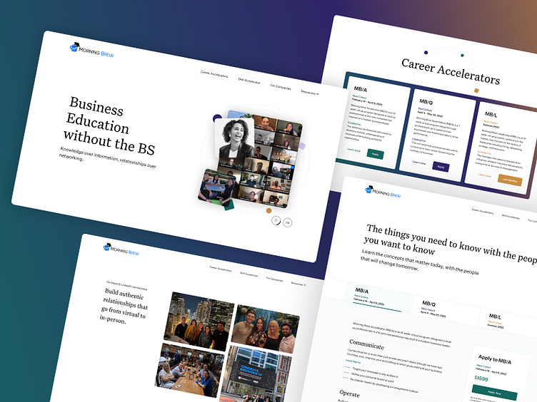
Morning Brew Accelerators Design
Morning Brew ☕️ is a media company that creates a famous daily newsletter that needs no introduction. They also produce podcasts 🎙, videos 📹, and events 🏢 for the business leaders of tomorrow. They also provide training through the Learning @ Morning Brew program. Our task was to design an experience that allows you to learn about the courses offered, attend an info session and apply for enrollment.
☝️ When working on such projects, it is always good to keep in mind that they can grow significantly over the years. 📈 That is why, in addition to the basic color palette (which allows you to quickly recognize the course categories that are currently available), we have prepared extended color-coding that can be used in the future. 🎨
☝️ We love subtle transitions that are impressive but not distracting! An important part of the site is the Community section. This is where we created smooth micro animations to accompany each click of the arrow icon. ✨✨✨
☝️ When introducing color-coding into an experience, you have to be consistent. That's why we designed the illustrations to match the different color variations. 🔴🟢🔵
☝️ An operative design should include a library of reusable components. A robust element base will allow Morning Brew to develop the site with new types of Accelerators and Sprints. 💪💪💪
_____________________________
Best way to stay updated? Follow Altalogy. 💪
Love begins with an "L" so don't forget to press this letter on your keyboard (thanks Dribbble for that shortcut 🙏) if you appreciate our work.❤️
We're available for new projects! Drop us a line at hello@altalogy.com.


