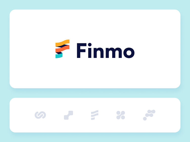
Finmo - Logo Design for Payments Aggregation Platform
Finmo is a payments aggregation platform. Our client's project, this service currently operating in Australia, but they have global ambitions. And we have no doubt that they will succeed. Finmo allows merchants of all sizes to collect via bank payments. Payments that are fast, safer, cheaper and above all simple.
We proposed sketches based on finances and payments, but also quite abstract. It was important for us that the image could be catchy, but not trivial and obvious.
The client's requirements: Simple and transparent text logo, use abstraction for the icon with color overlay. It is also important that it be modern and youthful.
In the next stage, new ideas were added and implemented in color. We decided to refuse to integrate the sign into the text, and the new versions turned out to be softer and friendlier.
The logo font is rounded and friendly, the letter O resembles a coin, but at the same time, straight lines retain seriousness and formality. It's still the financial industry.
In the next iteration, we chose the logo, made several variations, and picked up new colors.
The client chose the final logo in three accent colors and one dark. Blue stands for seriousness, turquoise for trust, red-orange for dynamism, and yellow for joy and positivity.


