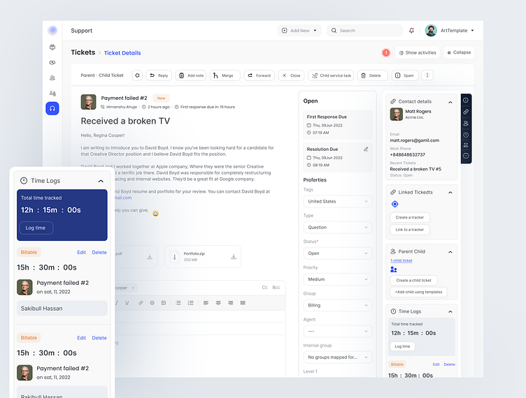
Learning Managment System
The Client
A learning management system (LMS) is a highly adaptable “ online education hub ” that provides a large and indispensable set of features to efficiently support teaching and learning activities for schools, businesses, and entrepreneurs.
Teachers and instructors also need an easy way to create content for their courses and organize their materials, data, and learner audiences.
Managers need a complete solution to train employees, clients, and partners and also generate revenue through the LMS by selling online courses.
The Challenge
Working with companies with a strong design culture is always challenging
1, There was no inspiration related to this content For which I had to study a lot about this project and research.
2, The project’s main goal was to create a strong new identity without losing touch with the existing community and building a comprehensive experience for its Product users.
3, What I solved was a challenge to explain to my client
The solution
We researched, strategized, and designed the new visual identity, supported by a brand new Dashboard with a design system. I have completed the backend to the front end.
My Workflow
Research: User research and competitor analysis has been done at the beginning to clarify the vision.
UX Design: the goal was to build a UX that is fast and easy to understand by the user
UI & Interaction: An eye-catching UI with an interactive color scheme, iconography, etc to attract users.
Prototyping testing: Once the design was ready, we created a prototype application to test the performance
What I learned
At first, I was a tad nervous as I knew this would be a lot of work. But, despite my fear and nervousness, I knew this was the perfect opportunity to hone my design skills.
1, How to finish the project in a more professional way keeping the client happy
2, I have improved my communication skills with the client
3, How to solve big problems with the research.
4, This project gives me an understanding that how difficult it is to introduce a small new feature into a reputed company. The touch points we need to consider before changing a small button on a screen
I had a lot of fun 😃 doing this project Because my client was too much fun man as well as a Flexible man and also an expert with business policy and I hope you enjoyed reading it too
Check Full View on Behance
Available for the new project\
Skype | live:.cid.6173ee2516f4b011
Follow Me:
Instagram | Behance | Linkedin | Dribbble | Facebook | UI8 | Uplabs | Creative Market


