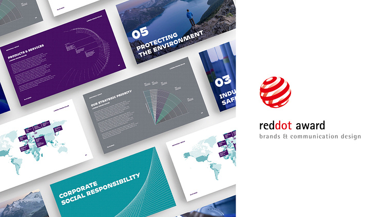
Metafrax Group
New chapter for an industrial leader
Foundation of Tomorrow
Metafrax Group is the largest methanol producer in Russia and Europe with more than 65 years of experience. Methanol and its derivatives are essential for production of thousands of everyday items – from pharmaceuticals to furniture and fuel. Metafrax Group needed to bring its brand in line with its business strategy. As the company was starting a new chapter of its development, our agency was engaged to develop a new brand for Metafrax Group.
Challenge
As a result of organic growth, strategic acquisitions and cross border projects, Metafrax Group faced the challenge of bringing its brand strategy in line with its company size and business ambitions.
Due to the lack of common communication principals for the whole group, the subsidiary companies had some communication difficulties. The group's increased scale and implementation of new technologies required a clear long-term brand strategy. As the company was starting a new chapter of its development, our agency was engaged to develop a new brand for Metafrax Group.
Solution
We suggested to to unite all subsidiary brands under one umbrella brand, which would enhance their integration. The new brand was represented by the slogan «Foundation of tomorrow». It reflected the importance of the company's work and its aspiration to the new technological frontiers in line with the world trends.
The presentation of the new brand was held at a major industry conference and was marked by the launching of several strategic projects. This cooperation continued with collective work on the Group's websites, its communications strategy and media promotion.
Brand Positioning
Following ambitions of the company, our strategists looked beyond methanol production and considered the business dynamics of Metafrax Group from the viewpoint of the global chemical industry trends. We developed the brand proposition «Foundation of Tomorrow».
This new brand promise on the one hand emphasizes on the reliability and stability of the company, and on the other hand takes us to the future, demonstrating that Metafrax Group doesn’t stop on what it has already achieved but is ready to do more and to do better.
Brand Name
We recommended Metafrax Group to unite all subsidiary brands under one umbrella brand. In order to do that we developed unique brand names that reflect both the subsidiary companies’ business function and affiliation with the Group. The key production company was named «Metafrax Chemicals».
Two Metafrax trading companies that used to be called «Trading House» and «Metadynea Trading» (a name that remained from a historic acquisition) were given clear and definitive names «Metafrax Trading Russia» and «Metafrax Trading International» respectively. Changes have been made for all 9 daughter brands of the Group.
Design
Our designers created three unique design worlds. During one of the strategic sessions with Metafrax Group, its top management voted to pick one of them. The selected design concept was called «Living System».
Metafrax Group's operation and business processes form a continuous system of communications. As new elements are added, the Group's architecture evolves like a living matter, sustaining ecological, social and business environment.
Logo
The central element of the logo is a dot – a symbol of balance and new beginning. The dot forms a circle, a symbol of unity and integrity. Connections between the dots represent combination of resilience and movement.
Incline of the spherical sign sets a direction for growth and development. Wide letters of the wordmark represent openness and clarity of the new brand. The sizes of letter elements vary, becoming thinner near the connection spots, which makes the font look vivid and dynamic.
Brand architecture
There are nine sub-brands that are part of Metafrax Group, therefore we also had to create the brand architecture. We conducted research, which allowed us to advise on a new brand architecture. We recommended our client to create a vertical structure for a better integration of all sub-brands.
Font
We collaborated with Adam Katyi, an Austrian-Hungarian font designer. Together we developed Mohol Metafrax, a unique font for Metafrax Group.
Mohol is a sans-serif, contrast, slant font meant to represent integration of technology and industry into a kind of art. We advised to use this font for titles and headlines.
Colors
The principal color of the new brand is called Metafrax Purple. The purple color helps keeping inner focus. Noble and unique, this color signifies both stability and liveliness; it is a symbol of transformation from one state to another since purple is a mix of blue and red.
Pattern
Observations of chemical processes and molecular compounds transformation gave rise to the idea of a new pattern, which is represents a strong but flexible and living system. This pattern is to be used for branded products and can be used with any brand colors.
Brand Guidelines
The final document that we created was brand book for over 60 different brand collaterals: from business cards to storage tanks.
Websites
We also developed a corporate website for Metafrax Group and created websites for each sub-brand to implement the new brand online.
Implementation
New brand elements will be implemented on all the navigation systems of Metafrax Group facilities, transport and other brand collaterals.


