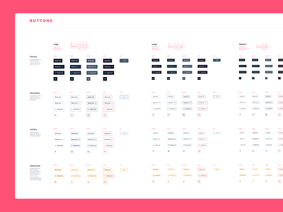
Buttons — Styleguide
I designed the interface components for a platform to recruit, vet, and source technology professionals for international companies.
The hardest part was finding a way to show errors, and destructive actions without using the classic red, as the brand's primary color is a very close-toned pink.
I tested all components with the parameters provided by WCAG to ensure that the contrasts and element sizes meet the users' needs for good information scanning.
More by Manti View profile
Like
