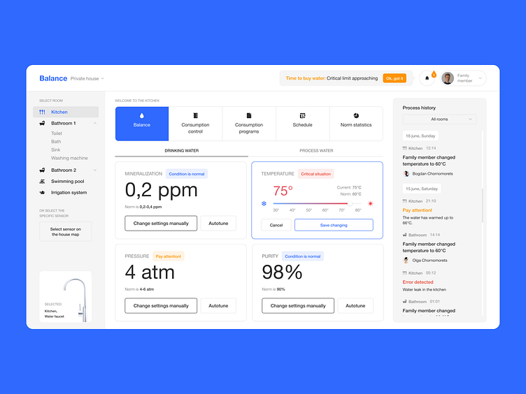
#24 Tanya Chornomorets | UX/UI Designer | Interface for Day Zero
Test task completed — June 20, 2022
Contact — @tanyachornomorets (telegram)
Portfolio— https://www.behance.net/tanyachorn43fb
Our comment:
We liked that the development process was laid out and divided into a certain number of steps. But the final product turned out to be very raw visually. Many solutions seem to be unfinished, for example, the side menu in the active state. In addition, the accents are poorly placed, and the spacing is not aligned, making the content unreadable.
More by Lazarev. talents View profile
Like


