Mirror Placement
Hey folks! 👋
A few weeks ago, we presented a project that we implemented at the turn of 2020 and 2021 for Atlantis Technology, a software house from Boston, USA.
This project was not only a huge challenge, but also the beginning of a long-term cooperation that we are continuing all the time. One of the next stages of our cooperation was the preparation of a complete redesign of the website of our daughter company, Mirror Placement.
As with Atlantis Technology,
here too our scope of work was wide and included:
→ Research,
→ Mooboards,
→ Custom illustration design,
→ UX/UI of the website,
→ Animations,
→ Complete front-end implementation including RWD.
Even though Mirror Placement is a completely separate company from Atlantis Technology, the client was keen to preserve certain visual elements common to both projects to emphasize their origins and roots.
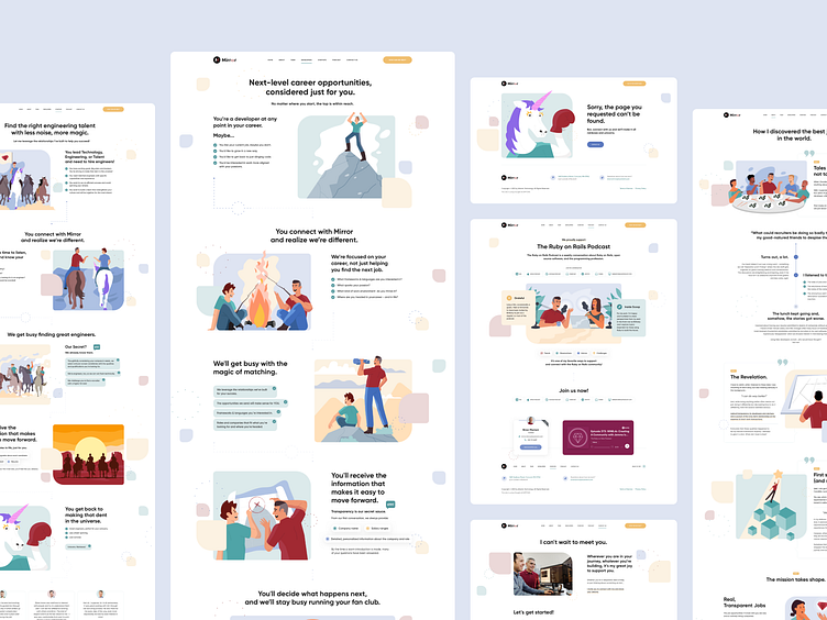
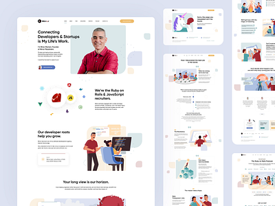
Today I would like to introduce you to the effects of our work on the UX/UI of individual subpages of the new Mirror Placement website.
You can also check our entire implementation online, available at
About us
The first key page was "About us". In line with the whole idea of the new website, the content was presented in the form of a coherent story, visualized additionally with custom illustrations made by our team, told by Founder Mirror Placement, Brian Mariani.
For developers & startups
Mirror Placement has two target groups. The first group are web developers who are looking for inspiring and engaging projects, and the second group are startups looking for web developers.
For these two groups, we have prepared two separate subpages, which are also separate landing pages.
Team & Contact
Next, we have prepared a subpage presenting the Mirror Placement management team. An important element was the presentation of full BIO people and bringing them closer to the target groups.
In addition, we have shown the "Contact" subpage here, which is crucial from the contact perspective.
404
We like details because we believe that they make up the uniqueness of a given website. In this case, it was no different and the series of custom illustrations created by us was extended with a unicorn, which not only identifies with startups, but in this case is the leading element of the presented story.
One example is the 404 error page, which can also be custom and informational.
Thanks for your attention!
Be sure to check out the full case study of this project we shared on the Behance platform. ✨
https://www.behance.net/gallery/137358115/Mirror-Placement
__
You can also check our entire implementation online, available at
__
Hit "L" If you like it. ❤️
Soon more! 🙌
Would you like to implement a branding, website or a mobile application,
but you do not know where to start?
💌 Write at biuro@visiontrust.pl
and let us find your place in networkspace.
Enjoy and have a nice day! 🚀


