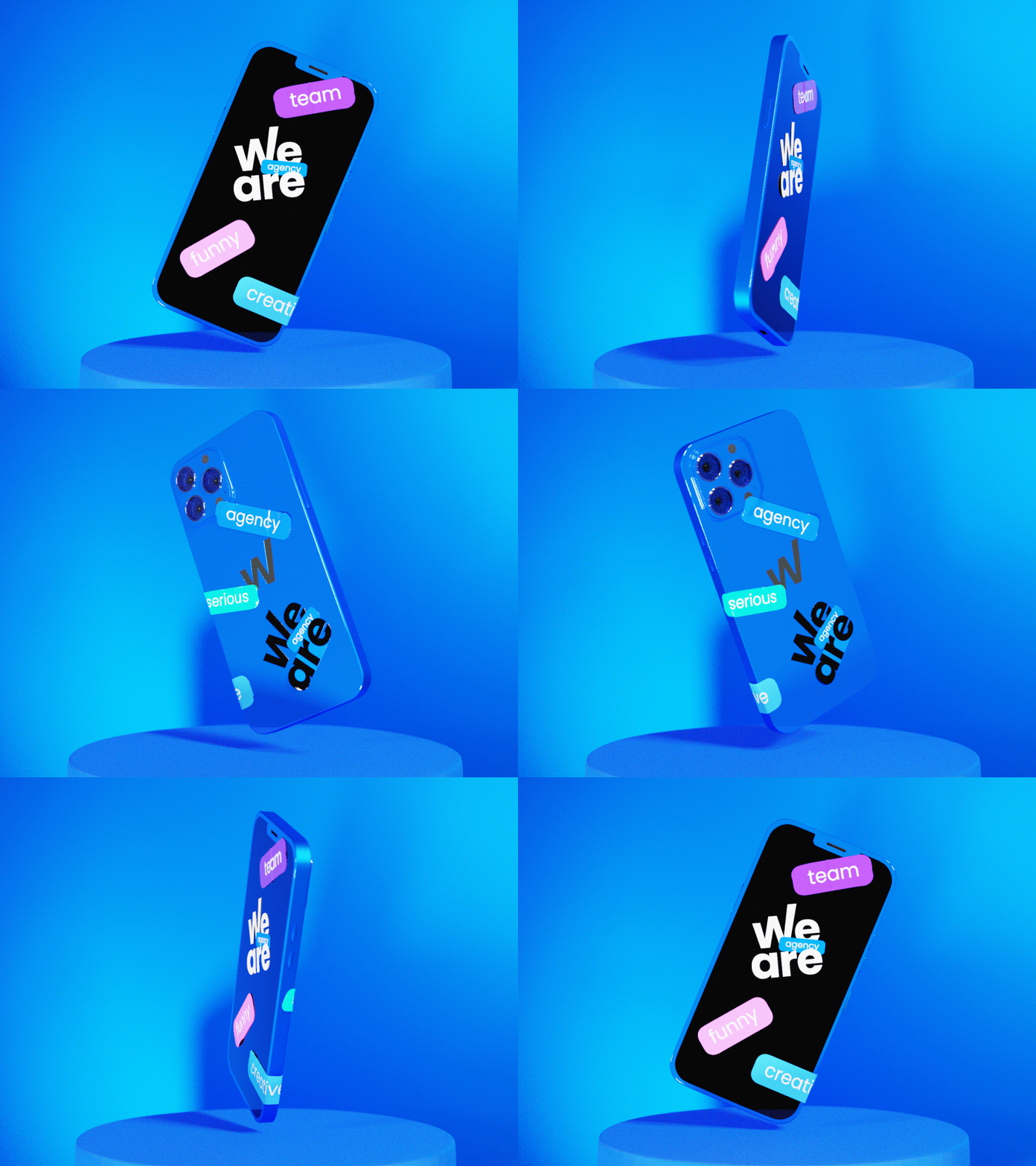
Logo and corporate identity for We are agency
Our client is a new project by the SalesArt marketing agency.
The We Are Agency team has a specialized field of targeted advertising, so the clients can be sure that experts with great experience will work with them.
Our team has designed a minimalistic logo, which has the word "We" located above the word "Are" — this is a metaphor referring to how easily the agency team sorts out all the work of targeted advertising for their clients.
For the corporate colours we have chosen blue, violet, pink and green. They have been selected for the following reason: if you look at the most popular social networks logos, you will find the same palette.
Want to boost your business with memorable design?
Get it with 10% OFF via promo code «Dribbble»⬇
More by Logomachine branding agency View profile
Like
