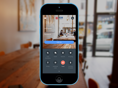
UOB Mobile Banking App Main Screen
I'm using mobile banking a lot, and it annoys me that the interface looks bad. I only designed the main screen for now, but it would be interesting and challenging to design the other screens as well. See the attachment for the comparison with the existing interface.
Do you think I've made something better?
Note: I've made a post on my blog about this: But We've Always Done It That Way. That's Why It's Bad.
More by Borrys Hasian View profile
Like

