Wireframes
𝐌𝐚𝐤𝐢𝐧𝐠 𝐖𝐢𝐫𝐞𝐟𝐫𝐚𝐦𝐞 𝐨𝐟 𝐏𝐫𝐨𝐣𝐞𝐜𝐭.
𝑫𝒆𝒔𝒊𝒈𝒏𝒊𝒏𝒈 𝒂𝒏𝒅 𝒅𝒆𝒗𝒆𝒍𝒐𝒑𝒊𝒏𝒈 𝒘𝒆𝒃𝒔𝒊𝒕𝒆𝒔 𝒕𝒉𝒂𝒕 𝒘𝒐𝒓𝒌 𝒂𝒄𝒓𝒐𝒔𝒔 𝒎𝒖𝒍𝒕𝒊𝒑𝒍𝒆 𝒅𝒆𝒗𝒊𝒄𝒆𝒔 𝒊𝒔 𝒂𝒏 𝒊𝒎𝒑𝒐𝒓𝒕𝒂𝒏𝒕 𝒑𝒂𝒓𝒕 𝒐𝒇 𝒕𝒉𝒆 𝒘𝒐𝒓𝒌 𝒘𝒆 𝒅𝒐 𝒐𝒏 𝒕𝒐𝒅𝒂𝒚’𝒔 𝒘𝒆𝒃. 𝑹𝒆𝒔𝒑𝒐𝒏𝒔𝒊𝒗𝒆 𝒅𝒆𝒔𝒊𝒈𝒏 𝒊𝒔 𝒇𝒐𝒓𝒄𝒊𝒏𝒈 𝒖𝒔 𝒕𝒐 𝒓𝒆-𝒕𝒉𝒊𝒏𝒌 𝒂𝒃𝒐𝒖𝒕 𝒉𝒐𝒘 𝒘𝒆 𝒑𝒍𝒂𝒏 𝒐𝒖𝒕 𝒐𝒖𝒓 𝒔𝒊𝒕𝒆 𝒅𝒆𝒔𝒊𝒈𝒏𝒔 𝒂𝒏𝒅 𝒉𝒐𝒘 𝒐𝒖𝒓 𝒑𝒂𝒈𝒆𝒔 𝒈𝒓𝒂𝒄𝒆𝒇𝒖𝒍𝒍𝒚 𝒇𝒊𝒕 𝒕𝒉𝒆 𝒅𝒆𝒗𝒊𝒄𝒆 𝒕𝒉𝒆𝒚 𝒂𝒓𝒆 𝒃𝒆𝒊𝒏𝒈 𝒗𝒊𝒆𝒘𝒆𝒅 𝒐𝒏. 𝑻𝒉𝒆𝒔𝒆 𝒅𝒂𝒚𝒔, 𝒘𝒆 𝒓𝒂𝒓𝒆𝒍𝒚 𝒆𝒗𝒆𝒓 𝒔𝒕𝒂𝒓𝒕 𝒂 𝒅𝒆𝒔𝒊𝒈𝒏 𝒘𝒊𝒕𝒉𝒐𝒖𝒕 𝒈𝒐𝒊𝒏𝒈 𝒕𝒉𝒓𝒐𝒖𝒈𝒉 𝒔𝒐𝒎𝒆 𝒔𝒐𝒓𝒕 𝒐𝒇 𝒘𝒊𝒓𝒆 𝒇𝒓𝒂𝒎𝒊𝒏𝒈 𝒑𝒓𝒐𝒄𝒆𝒔𝒔. 𝑬𝒗𝒆𝒏 𝒊𝒇 𝒄𝒍𝒊𝒆𝒏𝒕𝒔 𝒅𝒐 𝒏𝒐𝒕 𝒏𝒆𝒆𝒅 𝒕𝒐 𝒔𝒆𝒆 𝒂 𝒘𝒊𝒓𝒆𝒇𝒓𝒂𝒎𝒆, 𝑰 𝒕𝒉𝒊𝒏𝒌 𝒊𝒕’𝒔 𝒔𝒕𝒊𝒍𝒍 𝒊𝒎𝒑𝒐𝒓𝒕𝒂𝒏𝒕 𝒕𝒐 𝒄𝒓𝒆𝒂𝒕𝒆 𝒐𝒏𝒆 𝒊𝒏𝒕𝒆𝒓𝒏𝒂𝒍𝒍𝒚 𝒔𝒐 𝒕𝒉𝒂𝒕 𝒅𝒆𝒔𝒊𝒈𝒏𝒆𝒓𝒔 𝒂𝒏𝒅 𝒅𝒆𝒗𝒆𝒍𝒐𝒑𝒆𝒓𝒔 𝒂𝒓𝒆 𝒂𝒍𝒍 𝒐𝒏 𝒕𝒉𝒆 𝒔𝒂𝒎𝒆 𝒑𝒂𝒈𝒆
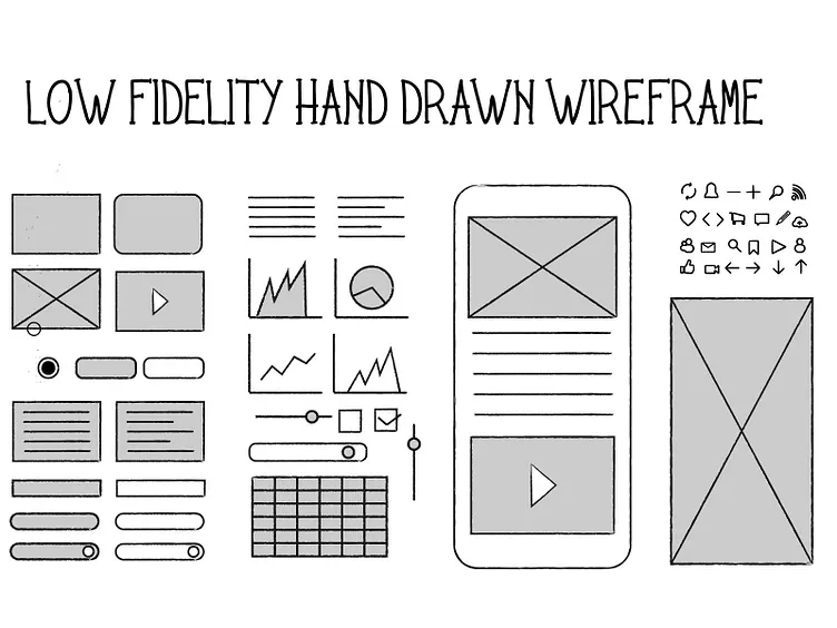
A wireframe is the skeleton of the page, usually drawn with basic shapes and lines with limited colors and styling. The point is to focus on figuring out layout and content placement, and solving navigation and functionality problems in a format that is easy to adjust. When planning for a responsive website design, we cannot continue to think through the wireframing process from a desktop only perspective. However, I understand that changing the way we think about these layouts and choosing a new direction can be a little challenging. For years we have spent our time designing fixed width layouts or maximum 960px width in our designs. Wireframing for mobile devices first (or from narrow widths outwards) helps us prioritize site elements while putting us in a good mindset for thinking about what content is most relevant to the site visitor and how your content becomes available to work with on wider screens.
#ui#ux#webdesign#design#uidesign#graphicdesign#webdesigner#appdesign#userinterface#interface#dribbble#uxdesign#web#creative#illustration#designer#graphic#illustrator#app#userexperience#inspiration#behance#uitrends#developer#programming#website#logo#webdevelopment#html#androiddeveloper