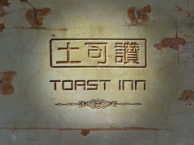
Logo of a Chinese-style Cafeteria
The logo design illustrates the unique charm of a homegrown cafeteria that serves a unique blend of in-house coffee and wholesome local delights at sensible prices. Its speciality is a unique blend of carefully selected coffee and tea directly from the growers. The first two Chinese characters are direct translations of the word "Toast". The last character is a pun for "Station" which also means "Praised" in Mandarin. Taking centre stage at the logo is a single stream of aroma rising from a Chinese-style teacup exemplifying the traditional yet forward-looking spirit of the brand. The background image is taken from one of the actual tables uniquely built by the client.
More by Pageii Studio View profile
Like


