EZ Credit Card Case Study
UX-UI Design
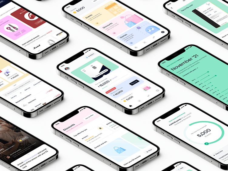
Owing to our experience in the Fintech vertical, we understand that finances go hand-in-hand with trust. We built two touch points: a micro-site and an app, that boosted confidence and engagement, which led to trust. The micro-site was built to highlight the expansiveness of the app, while the app was to bolster engagement, motivation, and retention.
The colour palette was chosen to make it fun and exciting for the Gen Z audience, enticing them to use the app more. Custom cards, illustrations, and 3D art were used to further connect with the younger generation. We deliberately went ahead with a sans serif typeface that could make the product scalable as well as convey its prowess with clarity.
The UX writing was planned carefully, starting with the development of a distinct voice. We personified the brand as someone who’s reliable, spontaneous, fun, and loves indulging in premium experiences. This was translated into our content through a lingo that resonated with Gen Z.
Simplifying everyday monetary transactions
Gen Z is a generation that lives and breathes digital. To connect with them and further enable their financial freedom, we enabled UPI payments on credit.
This, coupled with the benefit of 0% EMI on medical bills gave users the ability to take care of themselves and their loved ones, no matter the situation.
Facilitating budgeting skills and building good financial habits
We noticed that the new-age generation craved financial independence but felt lost. To aid them, we created a platform that allows them to get a detailed insight into their expenditure on a monthly & weekly basis.
They can also set limits on how much they want to spend and will get notified in case of overspending. This further inculcates the habit of saving and spending money wisely.
Creating an exclusive community that encourages adoption
Everyone wants to belong somewhere and Gen Z is no different. Our focus was to ensure that the app would help today's youth to be a part of and grow with a community.
How? We gave them access to special events and parties. These were tailored to their preferences, so they could decide whether they wanted to attend them to network or simply unwind.
Gamification to encourage retention
Gen Z is hard to retain in most services, and so, we decided to make user engagement a core aspect of this app. We gamified the system as a way to keep our young audience more excited about using credit.
The more purchases you make, the more rewards you get! There were also specific reward games, where you choose what you get. For example, a game where you can win an iPhone after you reach a certain number of points.
Let us know your thoughts!
Check out our other projects on Dribbble!
Press "L" or "F" to show some love!
We're available for new projects! Let's talk at hello@pineapple.design Check us out on - Instagram | LinkedIn | Twitter


