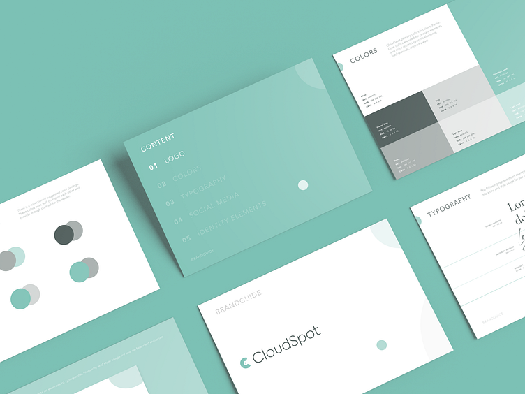
CloudSpot - Logo Redesign for Gallery for Photographers
Sometimes minor changes can lead to a complete change in perception. Here is an example of a logo redesign for our client.
Here you can see how minor changes in detail can have a big impact on the whole design system. It gives a good result: refresh the brand and breathe new life into it. Which was our goal!
Cloud Spot is a free client gallery for photographers. The easiest way for photographers to deliver and sell their photos online.
Check out this case and share your feedback 😉
We've redesigned the logo. The main client's request was to refresh the logo and make it more advanced. At the same time, make a minimum of changes and leave it recognizable.
The first step was to update the icon. Here you can see the process of searching for different directions. Next, the selection of a font that matches the character of the brand, colors and typography.


