Webinar landing page

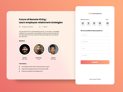
Why should a professional webinar page be boring with a typical white and blue interface? I like looking at problems from new point of view. So, I’ve used warm colours so that the page looks inviting while ensuring professionalism because a webinar website should make the user feel invited.