A website refresh
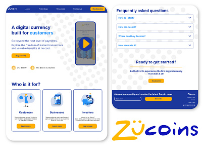
I was tasked with updating a website design.
My parameters were simple: no clutter.
I kept the homepage very high-level to make it easy for the user to understand what Zucoins is and how it works. Most people don't like clicking back-and-fourth between pages on a website to learn about it, they like to simply scroll. So, that was how I built the site.
You can review the Figma file here: https://www.figma.com/file/9vBir9HV3Gqo3InygtgK4F/Zucoin-Website---HOLMES?node-id=2%3A2
More by Christine Holmes View profile
Like
