LIN office | by xolve branding
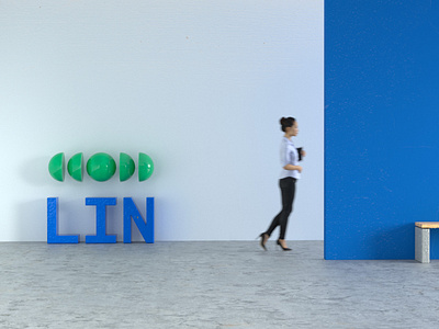
Previously, LIN sub-brands are clustered and there was no connection between them. In the new visual system, we transfer the design language from the master identity to the sub-brands. Typography is set to Livvic as primary. Blue and green, which symbolize trust and growth and are chosen as primary color palette. The use of the symbol extend across the applications, from digital design to print production. LIN rolled out its new identity on the first day of 2020, a first step to welcome all the possibilities of the new decade.
Full case study - http://www.xolvebranding.com/work/lin-center-for-community-development/
More case study - http://www.xolvebranding.com/works/
