LIN stationary | by xolve branding
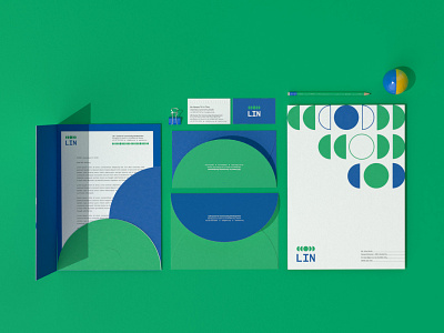
LIN is the fabrication of the Listening, Inspiring, and Nurturing. In the new wordmark, the three letters possess the same width and height which suggest a sense of equality. Apart from that, the spaces between the elements in the new system are deliberately multiplied to indicate the impactfulness. Altogether, the new look is modern, dynamic yet simple and purposeful which helps express and amplify LIN’s long term missions.
Full case study - http://www.xolvebranding.com/work/lin-center-for-community-development/
More case study - http://www.xolvebranding.com/works/
