Messenger Logo Design Process
he process of sketching ideas is challenging for many young designers. Most of them may say things like “I can’t draw” and “OMG, this is really hard. I spend countless hours on it, but it’s still not perfect.”. However, this isn’t the case. As a matter of fact, achieving a desirable result requires patience and wouldn’t happen on the first go around. Start drawing your ideas on paper immediately after deciding on them. Do not worry about the outcome because the goal is not perfection. In this post, I will show you the Messenger logo design process and show you how to get your desired result.
Before moving forward remember that you shouldn’t jump into software the moment you have an idea in your head, because there is a long way between an initial idea and the desired result. In fact, the outcome is much more different than the original idea. The two concepts are as different as night and day. It doesn’t matter how poorly or well you sketch your ideas, start with a piece of paper. Sketching is an effective brainstorming tool; it leads to new ideas. Actually, we are not trying to draw a masterpiece, but rather, we are just trying to find and evaluate ideas that are in our minds. When we put our ideas on paper, we are able to see how good or bad they are.
Here’s how I created the Messenger logo;
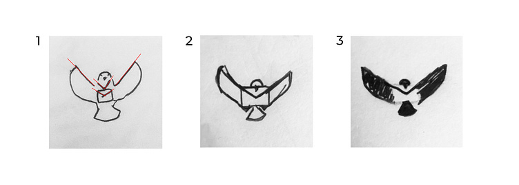
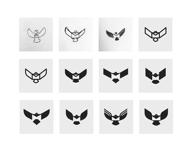
I have included three of my first sketches for this logo below. At the time, I had no idea how it would look. As you can see, I made incremental improvements to the mark.
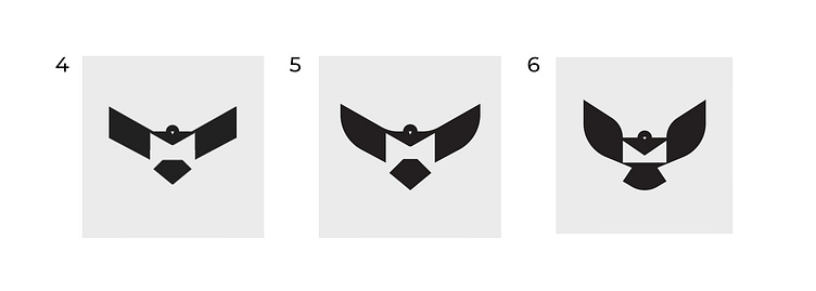
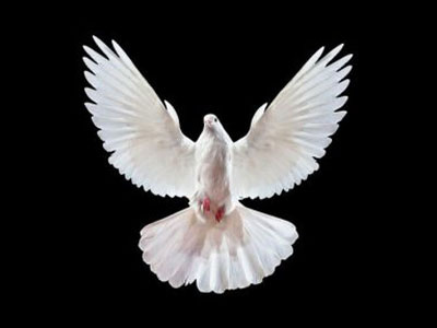
It’s time to convert our sketches into vectors in graphical software. Due to its sharp angles and corners, number 4 does not resemble a pigeon, but rather an eagle. It’s difficult to portray the natural shapes of a pigeon body, particularly a flying pigeon body. To deal with that, I need to look at my design in-depth and analyze it. In order to do this find an image that closely resembles your idea, then figure out what sets pigeons apart from other birds.
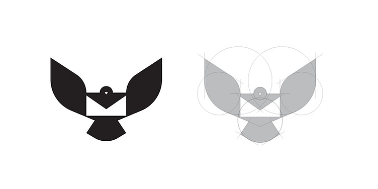
It took me a lot of back and forth to figure out the best way to implement the messenger mark. After trying various methods, I found the perfect cure and angel for the wings and tail. In addition, I tried several ways to have a mail pocket in the negative space. By adding those small components to the bottom, the mail pocket became more apparent. While in number 5, you can see that mail pockets do not come to mind easily.
While this is an important aspect we should consider, some parts of its body are essentially the same as other birds, so we can ignore them and keep things as simple as we can. Pigeons have a distinctive beak shape so I needed to consider this.
I suggested, however, that you design your logo based on the natural shape of a bird’s body, though you shouldn’t be afraid to use your imagination. You own your imagination, and no one in the world thinks the way you do, which makes it possible to design a unique mark. Your imagination makes the difference. It helps you to find a new way of solving problems.
Enter your text here...It’s time to convert our sketches into vectors in graphical software. Due to its sharp angles and corners, number 4 does not resemble a pigeon, but rather an eagle. It’s difficult to portray the natural shapes of a pigeon body, particularly a flying pigeon body. To deal with that, I need to look at my design in-depth and analyze it. In order to do this find an image that closely resembles your idea, then figure out what sets pigeons apart from other birds.
It’s time to convert our sketches into vectors in graphical software. Due to its sharp angles and corners, number 4 does not resemble a pigeon, but rather an eagle. It’s difficult to portray the natural shapes of a pigeon body, particularly a flying pigeon body. To deal with that, I need to look at my design in-depth and analyze it. In order to do this find an image that closely resembles your idea, then figure out what sets pigeons apart from other birds.
It took me a lot of back and forth to figure out the best way to implement the messenger mark. After trying various methods, I found the perfect cure and angel for the wings and tail. In addition, I tried several ways to have a mail pocket in the negative space. By adding those small components to the bottom, the mail pocket became more apparent. While in number 5, you can see that mail pockets do not come to mind easily.
While this is an important aspect we should consider, some parts of its body are essentially the same as other birds, so we can ignore them and keep things as simple as we can. Pigeons have a distinctive beak shape so I needed to consider this.
I suggested, however, you design your logo based on the natural shape of a bird’s body, though you shouldn’t be afraid to use your imagination. You own your imagination, and no one in the world thinks the way you do, which makes it possible to design a unique mark. Your imagination makes the difference. It helps you to find a new way of solving problems.
Okay, I showed you how I came up with my initial idea in the Messenger logo design process. The ideation process on paper is less restrictive and more creative than on screen. Using a piece of paper allows our hands and brains to work seamlessly together. So do not underestimate the power of ideation and sketching. The Messenger logo design process post is my first post about my design process. Of course, it’s not perfect, but I will make it better as time goes on. Your feedback is highly appreciated.