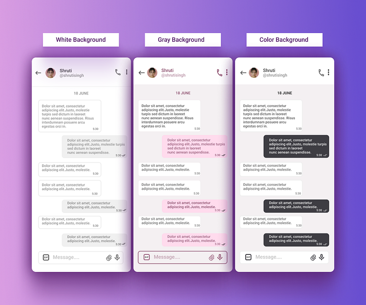
Day 17: Messaging UI- 60 days of Interface Design
Day 17:- Messaging UI
Background
Hi, I am Ratna, a self-taught UI/UX designer, creator, and budding UX researcher.
I love researching, experimenting, solving problems, creating intuitive designs, and learning from the experiences. I am motivated to learn, grow and excel in the design industry.
I took upon a challenge to learn Interface design in 60 days and share my progress daily so that the community could provide me with constructive feedback and aspiring designer can follow my learning curve.
Messaging UI
With this exercise, I tried to demonstrate the saturation between text, colors, and background.
With this exercise, I learned about:-
~ Behaviour of Text & Colors
~ Saturation & Lightness
Want to learn together! Connect with me through any of channels below.
