S - Task module design
Design approach
My design approach is simple and minimalistic based upon current design trends and my own mindsets. Also got a chance to review this with some users for their input. This approach is followed by almost all successful brands and making life easier for their users.
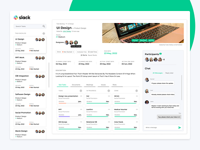
Task detail
Modals or popup are not user friendly for novices that’s why using single glance approach for task list and its detail information. The benefit of this approach a user can switch from one task to another easily and can take a look at useful information with minimal clicks.
Information architecture
Redesigned information architecture also keeping in mind best human centered design approach after doing some relevant R&D on tools and with my own experience. This is how a user would like to perceive information when it comes to this type of product domain. All important information in the form of “F” case study with important call to actions. Proposing “To-do” feature in the bottom tabs to make it little separate from the main task but this can be the part of main task and sub tasks. Also reducing the weightage of main task image and keeping it on the right-hand side for minimal attention. Above combination will decrease the eye movement for users.
Subtle but modern
Always try to keep my design very subtle and textual to make it meaningful for my users. Not using a lot of icons this time because I believe textual information can easily leads to quick decision. Modern shadows, legible typography minimal information making very smooth experience for users.