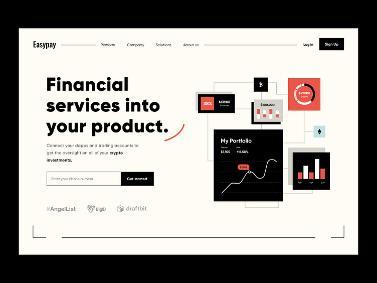
Easypay home page
Hello,
Today we share the design for a financial project we worked on as a team. The project includes an application for mobile phones and a web version. But today, we present Landing Page which generates new customers. An exciting feature of this work is that the client did not want to post an interface in the Hero section, and we came up with it. Create a composition from UI middle fidelity frames. It turned out very fantastic and dignified.
The branding style maintains the color scheme, and everything looks consistent.
What are your thoughts about this work?
⭐️ ⭐️ ⭐️
Art director — Taras Migulko
Design — emote.agency
⭐️ ⭐️ ⭐️
Awwwards | Behance | Live website
We are open to new projects 💌 hey@emote.agency
More by Taras Migulko View profile
Like


