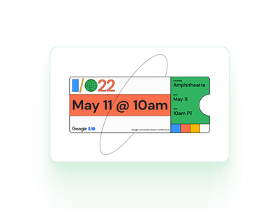
Google IO22 Pass
I think the Google IO22's branding was quite unique. It still used a flat design style, but it was quite refreshing to see the branding go well with Google's Sans font.
Trying to replicate the styling, I have uploaded a file for you to replicate on Figma Community: https://www.figma.com/community/file/1117439837393539806. Let me know if I should include this Dribble shot template within that file.
The file also contains a light Design System built just to manage this file with tokens naming convention and more.
Press "L" to show some ❤️
More by Dhananjay Garg View profile
Like
