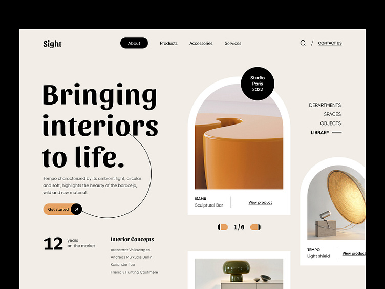
Sight home page
Hey all,
Sight is a turnkey CGI design studio. You know that the most crucial stage of any design is the implementation stage.
For example design. The interior can look chic on paper, but if it is not implemented - it’s just a concept. The same with our designs. That’s why creating and then launching this project together was so important. While it is under development and we work closely with the development team. To make everything look exactly as we planned.
Idea: The client has a lot of orders for design visualization but much less for maintenance and turnkey work, so the idea was to focus users’ attention on the fact that here you can get a full range of services.
Issues: How to show four critical things of the company through the design and be elegant and not look super expensive so that customers are not afraid to order services.
The solution is a clean light design, without general visualizations, only elements that make sense and that the customer sells in an actual store. And also the introductory Call to Action - Bringing interiors to life.
The general impression of the site is reliable partners with whom I will work hard and productively. That’s what we wanted. What do you think - did we do it?


