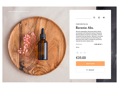
Daily UI 012 - E-Commerce Shop
This time without a layout. I wanted a little cleaner, some kind of clutter is felt due to the icons, or so it seems to me :) On the other hand, if you make the icons less noticeable, then the product card loses its convenience, the user has to be distracted from the purchase and spend seconds searching for them.
Photo Pexels.com
Feel free to give me some feedback. Thanks! 🤝
Contact for collaboration and project:
More by Evgeniy Mironov View profile
Like
