Railway Website Hero Section
Some weeks earlier, I redesigned the hero section of the Nigerian Railway website. It was a task given to me at the Zuri training, where I learn, but I took it beyond a task. I empathized with the sorry state of Nigeria. I felt the dishonor a poorly built national website could bring to a country. A country where there are more than enough competent UI/UX designers and web developers.
Although I'm still young in my UI/UX journey, I was able to spot some of the flaws of the website, as well as proffer realistic and efficient remedies. I will also state briefly the laws of UX which this website flouted. Even a young child knows that the hero section is too clumsy and therefore breaks Miller's Law: the average human's memory can only process few items at a time. Similarly, the website ignored Hick's Law by complicating decision making with too much options. More like, the website also disregards Aesthetic Usability Effect, because the website does not look good and gives a random user the impression that it doesn't work well.
The Jacob's Law is a basic and simple UX law that is quite difficult to break. Yet, this website succeeded in kicking against it, because it is not consistent with known railway booking websites. There should have been hierarchy, or a recommended option, between the sign in and register buttons. Lastly, the system status is not visible; it doesn't inform users of the tab on which they are. It defies Usability Heuristics.
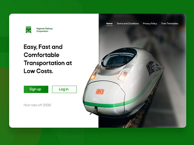
Having identified these problems, I redesigned the hero section with these considerations in mind. I made it as simple as possible and eliminated unnecessary information to allow users' convenience.
I do not believe Nigeria is too poor to hire good hands for national projects. The persistence of kwashiorkor websites like this is a slap in the face to our country, which is saturated with bright minds.
